Usability Example: Unsubscribe FAIL
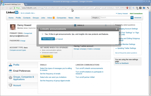
Last week I dug through several menus to try and unsubscribe from all the spam LinkedIn sends me. Today I got another email and at the bottom was an “unsubscribe” link that I clicked on. Here’s what I got:

Not only is this not an unsubscribe feature, LinkedIn gets bonus points for trying to sign you up for MORE e-mail.
Instead of screwing around with the half-dozen sub-menus again, I dropped them a feedback saying that this burns up good will, damages the brand, discourages me from engaging, and may in time lead me to delete my profile. There’s more than one way to search for resumes online.

Responses
Adam
Do you actually get any benefit from using it? I deleted my account a while back and it’s been great since. I never really got any positive usage out of it anyway, it seemed to just be a mutual back-patting site with few actual professional use cases.
Daniel Howard
Adam, it seems like a good way to promote yourself if you are in the tech job market.
-danny
Comment
Tiny Print:
<a href="" title=""> <abbr title=""> <acronym title=""> <b> <blockquote cite=""> <cite> <code> <del datetime=""> <em> <i> <q cite=""> <s> <strike> <strong>