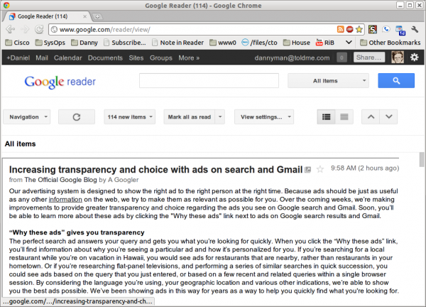
Google Reader Interface: -1
Note to modern web designers: since the displays are becoming wide and short, please do not squander vertical screen space. Here’s a good example of what not to do:
Viewed full size, you see a window that is 705 pixels tall. The OS claims 24 pixels, the web browser claims 90 pixels, and the web application claims 250 pixels. So, by the time you hit the actual content, 50% of the window has been wasted!
Squinting into a tiny pane to read news makes me angry. Google, you can do way way better than this!
Hotpatch: Install New Google Reader Rectifier for Chrome, which relies on you bringing up the left pane. (Thanks, Mike!)


Comment
Tiny Print:
<a href="" title=""> <abbr title=""> <acronym title=""> <b> <blockquote cite=""> <cite> <code> <del datetime=""> <em> <i> <q cite=""> <s> <strike> <strong>